A new symbol of passion for nature and science
Wordmark
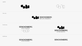
Logo system
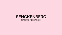
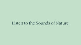
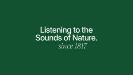
Slogan
Typography
Logo color system
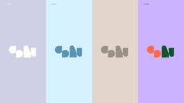
Logo play
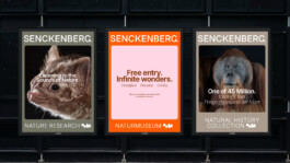
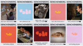
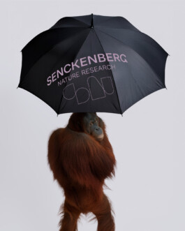
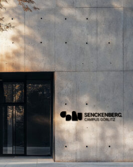
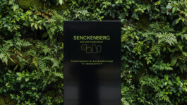
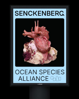
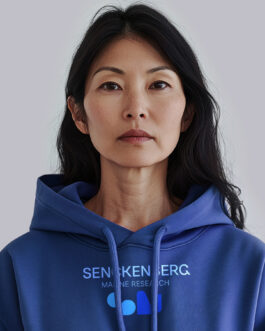
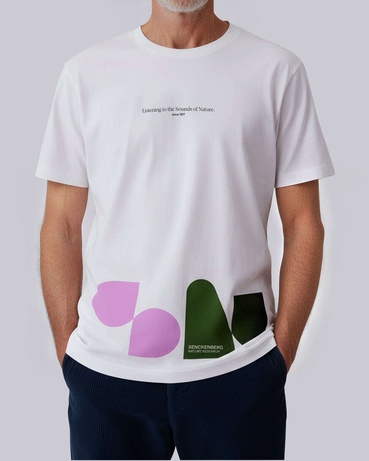
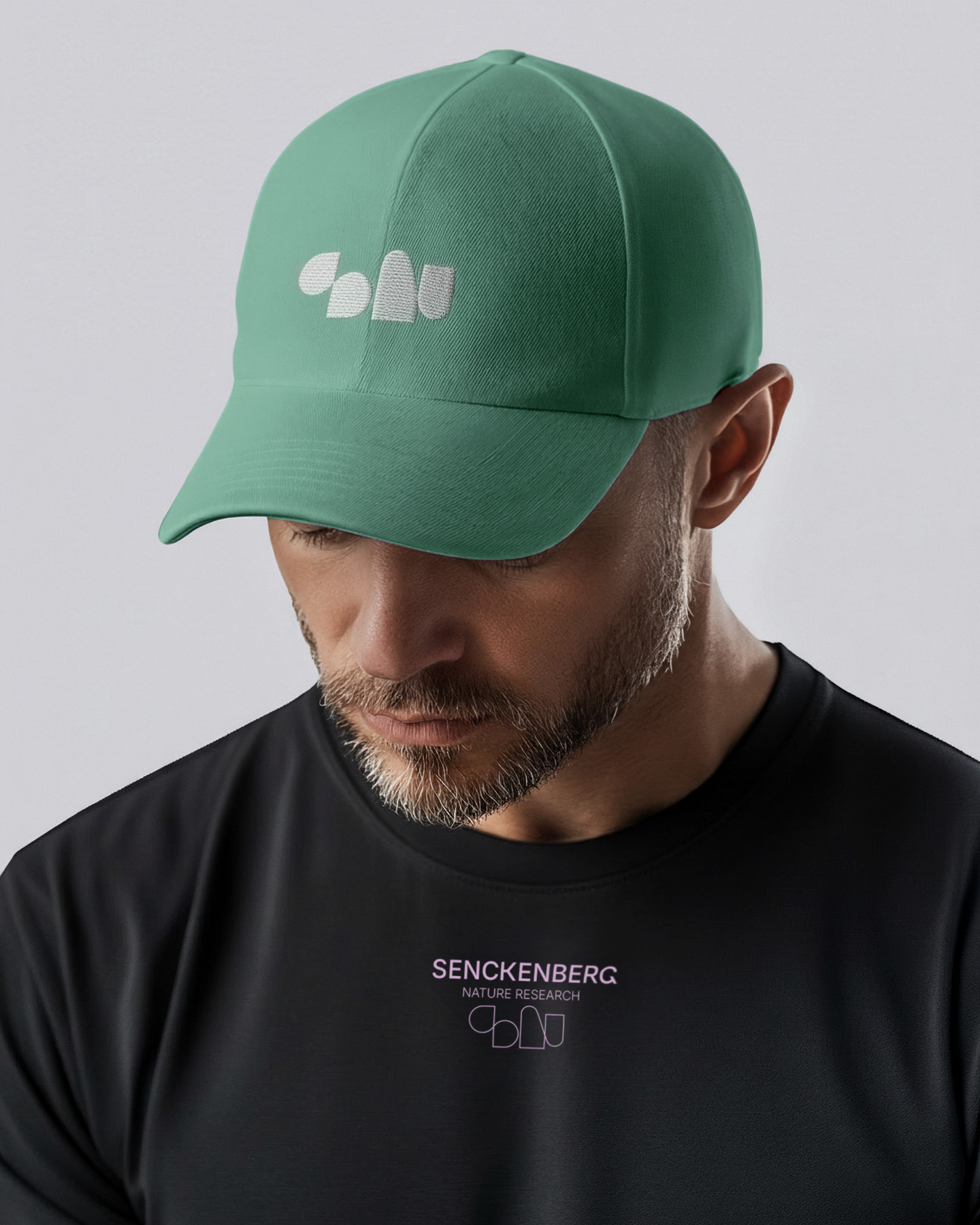
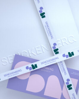
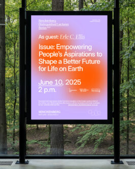
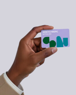
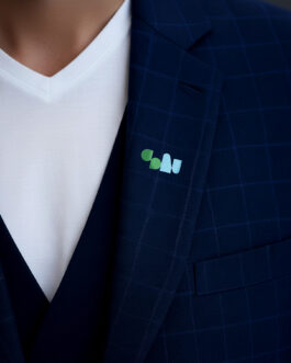
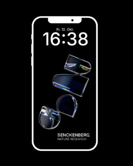
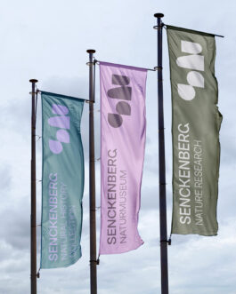
Design applications

Senckenberg Society for Nature Research — Rebrand
Text
Background
The institution Senckenberg looks back on more than 200 years of natural research. It all began with the pursuit of exploring nature — and with a museum in Frankfurt that aimed to make discoveries accessible to the general public.
Johann Wolfgang Goethe coined the term “Naturmuseum,” which remains a fixed expression to this day. It is not a natural history museum that merely looks back, but rather — more accurately — a museum of nature, presenting not only natural history in its exhibitions but also addressing the challenges of our time through scientific insight.
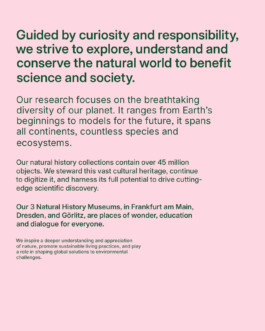
Today, the Senckenberg Society for Nature Research has grown into a scientific institution with 900 employees working in eight institutes across 12 locations, contributing to internationally outstanding research.
What began as one museum in Frankfurt — now one of the largest of its kind in Europe — has become three museums presenting science to the public and housing one of the world’s largest natural history collections, with 45 million objects.
This is the Senckenberg legacy — in short.
With the rebranding, Senckenberg sought an answer to how its complex ecosystem of research, museums, and collections could be represented in a contemporary and accessible way. For the scientific community and for the wider public. More visible. More emotional. Seamless across all touchpoints – from museum campaigns to science lectures, from profile icons to signage.
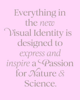
The goal: a strong, unifying visual identity for all.
Creative Idea
We unite what belongs together: Senckenberg and nature — distilled into one symbol for the entire institution.
A shared narrative derived from the name and its mission: the pursuit of exploring and understanding nature.
Two letters — “S” and “N.” One distinctive mark. A common denominator that aligns stakeholders and reinforces a collective identity. An identity that expresses passion for nature and research – and ignites curiosity. Rooted in the institution’s DNA.
Insights & Strategy
In a broad, participatory strategy process involving communication teams from all Senckenberg locations, we put the existing visual identity under scrutiny. What still worked? Where did it fall short? What was fundamentally missing?
The findings revealed a growing disconnect. The green-and-blue palette, while consistent from a corporate design perspective, failed to reflect the diversity and richness of nature’s content. The technical typefaces reinforced a rational tone but left little room for emotional resonance.
But one key insight stood out: the organization had grown historically and structurally. New institutes and museums had been integrated into Senckenberg’s framework. Previously, each of these entities had its own logo — the headquarters featured a Triceratops, another institute a swan, and a third a small monkey. What once fostered local identity eventually led to fragmentation.
The 2010 rebrand attempted to restore clarity by removing all individual logos and reducing the system to a typographic wordmark with a fixed claim. Externally consistent, yet internally unresolved. The emotional bond to the former symbols persisted; they continued to surface.
The strategic insight was decisive: uniformity alone was not enough. The new identity had to reconcile unity with emotional ownership.
It required a symbol with a shared denominator — one capable of representing all stakeholders within the institution, from ornithologists and paleontologists to museum teams and collection specialists, uniting scientists, curators, researchers, and communicators alike.
Execution
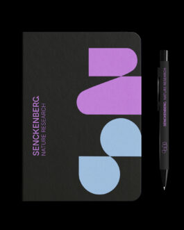
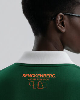
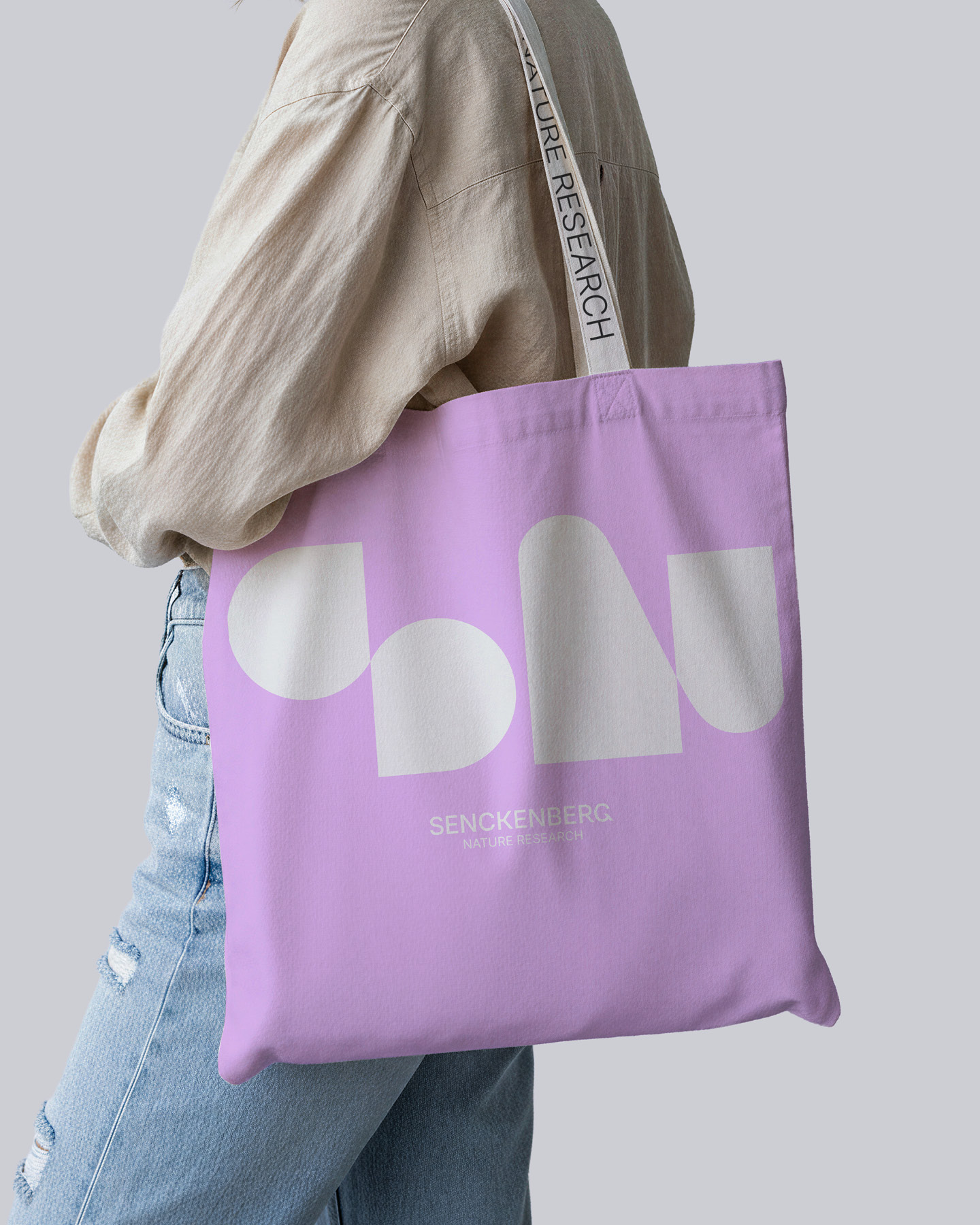
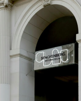
The design process began with the development of the monogram. The “S” for Senckenberg is inspired by organic structures, while the “N” references rock formations such as Stonehenge. Together, the symbol represents the two core disciplines united at Senckenberg: biology and geology. At the same time, the “N” stands for nature and operates as a unifying compositional element throughout the entire Senckenberg ecosystem — spanning research, museums, and collections — in both German and English.
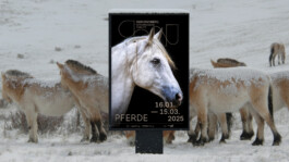
The symbol was conceived as a chameleon, capable of adapting its appearance to its environment — whether in black and white, in vibrant natural colors, or as illustration. It enables a wide range of stylistic expressions to calibrate the right tone for every touchpoint.
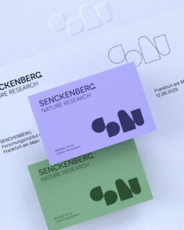
In redesigning the Senckenberg wordmark – inspired by an Art Nouveau inscription at the museum’s entrance — we introduced a distinctive “G” as an eye-catcher, inviting a closer look.
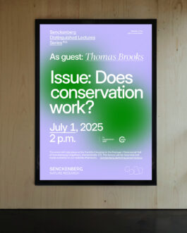
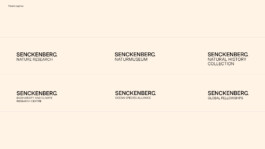
We then developed a system to combine the name with clearly descriptive sublines — for museums, projects, or formats. Or with the mission statement “Nature Research,” used at touchpoints where the content needs clarification.
These elements form a responsive brand identity, offering flexibility in how they relate and interact — enabling the optimal sweet spot at every touchpoint.
Alongside a set of predefined combined logo variants, all brand elements can be typeset and edited in a customized version of the typeface Inter, ensuring efficient in-house application across media. Complemented by a serif typeface designed by Margot Leveque, the typographic system spans from progressive to emotional, modern to factual.
Finally, the new identity abandons rigid corporate color rules. Instead, nature’s color diversity informs the visual identity and Senckenberg’s content. Color harmonies derive from key visuals or strategically align with the zeitgeist, ensuring all publications feel coherent, relevant, and fresh.
Results
To bring the new brand to life quickly while maintaining manageable resources and budgets, we deliberately avoided a big-bang launch and instead opted for a phased rollout across media channels.
This approach ensures a gradual, sequential transition to the new identity — with iterative implementation for more complex platforms such as the Senckenberg website, which comprises several thousand pages.
At this stage, there are no hard performance metrics yet — but the response speaks volumes. The client is receiving enthusiastic feedback from both the scientific community and museum visitors, highlighting how contemporary, engaging, and visually compelling science can be.
Internally, the new identity has achieved strong acceptance and active adoption. It reinforces a shared sense of belonging among 900 employees. The logo is embraced, explored, and playfully applied throughout the organization.
A clear sign that the identity resonates — both externally and internally.
A new symbol of passion for nature and science
Wordmark
Logo system
Slogan
Typography
Logo color system
Logo play
Design applications
Planning a project?
Get in touch with us:
studio@studiomennicke.com
J.M.S.C.
Jens Mennicke
Studio Cologne
Wilhelm-Mauser-Str. 49 B
50827, Cologne/Germany
studio@studiomennicke.com
+ 49 176 10 506 505
Imprint
© 2026